Improving Consistency and Collaboration
Designers on VMware Tanzu Observability faced challenges in maintaining consistency with the company’s in-house design system. As a design manager, I led the team in the creation of a product-specific design library. This effort helped us improve consistency within the product and across the portfolio and also helped us become better collaborators within our team and with our engineering partners.
Taking Stock
One of my first tasks when I started working as a Senior Product Designer on Tanzu Observabiity was to audit the product for consistency. One of the goals of this audit was to see how close we were to VMware’s design system, Clarity and to see how we could be more consistent with other products in the portfolio. (Incidentally, doing this audit turned out to be a great way to onboard and learn the product because I got to see pretty much every part of the product and play with the interactions.)
The audit revealed a lot of inconsistencies with Clarity. This was not a surprising outcome. Tanzu Observability originally came into VMware through an acquisition, and as part of the initial integration, the product was skinned to look more like other VMware products. I say “skinned” because the product could not actually use Clarity because it was built using a framework the Clarity did not support. What this meant in practice is that Tanzu Observability was not picking up updates to Clarity, so over time the gap between the product and the design system widened. Another troubling fact revealed by the audit was that the product was not always internally consistent. Similar things were done different ways in different parts of the product.

Part of the Tanzu Observability consistency audit
Inconsistency is never great for users, but it was becoming a challenge for designers and developers as well. The team was growing and there was not source of truth that we could rely on. Furthermore, we had recently done an accessibility audit as part of preparing a VPAT (Voluntary Product Accessibility Template) and we had some things to fix to improve accessibility.
Pattern and Component Library
After discussion with the team, we determined that what we needed was a design pattern and component library specific to our product. Our hope was that having a good library would do a few important things for us. It would:
Help us provide a consistent, accessible experience to our customers.
Improve efficiency by helping designers create new mockups quickly.
Allow for smoother handoffs with engineering.
We would not be starting this effort from scratch. We had atomic-level components in the Clarity design system, and our predecessors had created a design library with some of the components that are specific to our product. Our task was to marry these two, and create a more comprehensive library to meet the unique needs of our product.
We worked with our cross-functional parters to determine how we might make progress on this without disrupting our day-to-day work. As a design team, we recognized that this was going to require quite a lot of collaboration to work through the issues, because proposed changes could have cascading effects. We needed plenty of face time to validate use cases and think through solutions. We were able to get approval for a four-day virtual offsite to kickstart this new initiative.
Jump Starting the Process
At this point I was a manager on the team, so part of my job was to plan this offsite. We had a few goals for the week. We wanted to improve our Figma component library. We wanted to mockup a more Clarity-aligned version of our product to illustrate where we eventually wanted to get. And because our team had been growing we also wanted to get to know each other better and have a little fun.
One of the challenges with coming up with a schedule and agenda was that the design team was spread across multiple time zones. I designed the schedule in such a way that we would be together as a large group for several hours, but the rest of the time would be spent in smaller, timezone friendly groups doing more focused work. In the larger group we discussed system guidelines and specific topivs. We also spent an hour each day sharing PechaKucha presentations to help us get to know each other better. The smaller group work was divided up by product page type (e.g. forms, list pages, etc). These groups worked on creating components and templates for their areas. The smaller groups used the branches feature in Figma to avoid disrupting other groups or breaking our existing library. Teams were empowered to make some decisions, but would also bring questions back for discussion with the larger group.
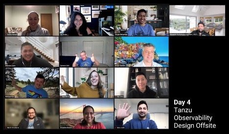
Happy designers at the virtual offsite
Offsite Outcomes
The offsite was a success. In terms of the design system, we had some significant outcomes: We added numerous components to our Figma library. We created these components using Clarity colors, styles, and atomic components so that these components would stay in sync with the Clarity system. We also updated existing components to leverage Clarity to future-proof them as well. In terms of outcomes for the team, we certainly came away with a sharper eye for consistency. We were more productive by having ready-made components that we could drag and drop into mockups, ensuring better accessibility and smoother handoffs. An perhaps most importantly, we came away as better collaborators because we knew each other better.

Examples of components from the Tanzu Observability design library
Keeping Momentum
We obviously could not create a complete library for a highly technical product in just four days. Not only was there more to do, we also recognized that creating this initial design library was not the end. Like a garden, design systems require ongoing care and maintenance. Moving forward, we would need to continue the design system work in addition to our normal project work. So we created some processes to ensure that would happen.

Screenshot of our template and component tracker
We instituted a bi-weekly meeting to share and discuss design system work. We added some governance and control over how the library would be updated, appointing reviewers to ensure that changes were sound. We started tracking the progress of components and templates in Confluence so that there was visibility and accountability for making continued progress. Finally and significantly, we started a monthly meeting with our engineering counterparts to review work and talk about how we might bring our design components and their code closer together so that everyone could be speaking the same language.
Through all this, we saw how minor changes can have reverberating effects throughout the product. We would need to be mindful about how and when we introduced novel solutions. The pattern and component library helps with that. Equally important is the improved collaboration, product knowledge, and attention to detail that doing this work helped us build.